Got it! I'll be in touch.
Oops! Something went wrong while submitting the form.


.webp)
.webp)
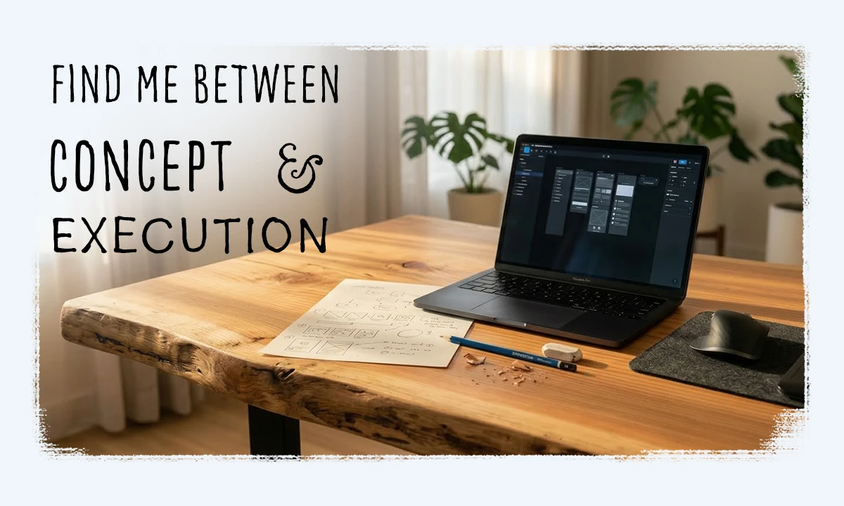
I help ideas get the attention they deserve: logos, graphics, websites, copy.
First impressions happen quick.
A tap or click will make it stick.
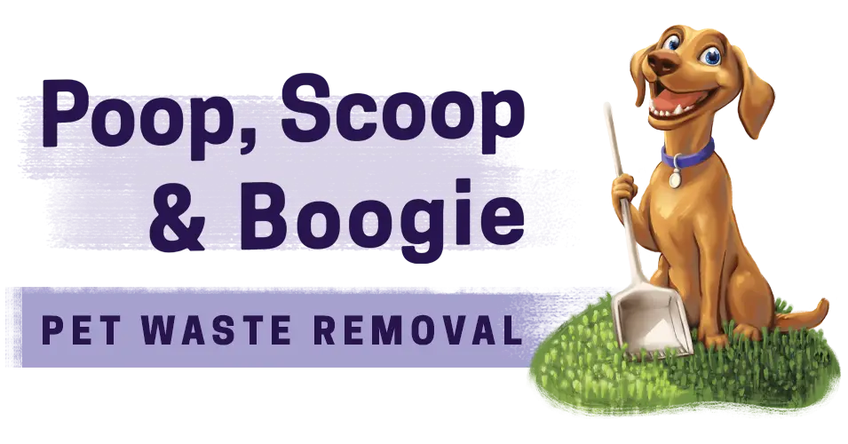
Poop, Scoop & Boogie needed a site that didn’t stink, so I designed them a brand that cuts through the crap.

The pet waste pickup industry is a quirky niche – it doesn’t need to take itself too seriously. With bold illustration and playful taglines, brands can lean into being approachable. A dirty problem is better solved with grace and humour.
My client came with a clever name and the spark of an idea for a local service. Everything else – the brand, the offer, the site – that was my part. I built it from the ground up with voice, visuals and structure. I developed it in Webflow, optimized for search, and set up social accounts with one-click booking.
What started as a scrappy idea is now a solid presence with a growing local following. At first I wondered, how much demand could there be for a service like this? Turns out, there are plenty of dog owners with poop problems.


Simply Detailed is a cleaning company with branding that's actually clean –
subtle and uncluttered, as straight as their service.
Simply Detailed is a cleaning company with branding that's actually clean – subtle and uncluttered, as straight as their service.
Residential cleaning websites often come wrapped in flashy offers and exclamation points, but this one skips the hype. In just a couple of weeks, we had the logo designed, business cards printed, and a clean, responsive website ready to roll. By week four, we had marketing material hot off the press and early job photos were live across socials.
Not every business needs a complicated website to show who they are, or how they help. But the right touchpoints still matter. It’s a show of trust for a brand to invest time in what others might rush.
Not every business needs a complicated website to show who they are, or how they help. But the right touchpoints still matter. It’s a show of trust for a brand to invest time in what others might rush.


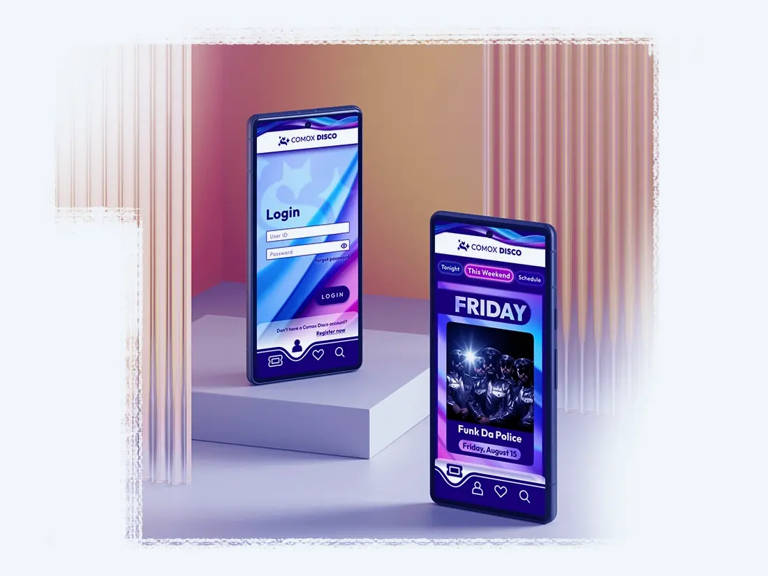
In a town known for its quiet nights, Comox Disco imagines evenings worth staying up for.
The average Comox Valley resident is entering mid-life with kids and a Costco membership. So much time gets buried in routine. This app imagines a way to shake the dust off with music, movement and social connection.
This platform is part of an interaction design study. Users can explore mock events in Comox and purchase tickets. The 'Spotlight' section looks at the idea of rewarding repeat visits through community interaction – a rolling gallery of photos where users can be featured. The finished design is loud and flashy, matching the energy of the events themselves. (Images and video are AI-generated)

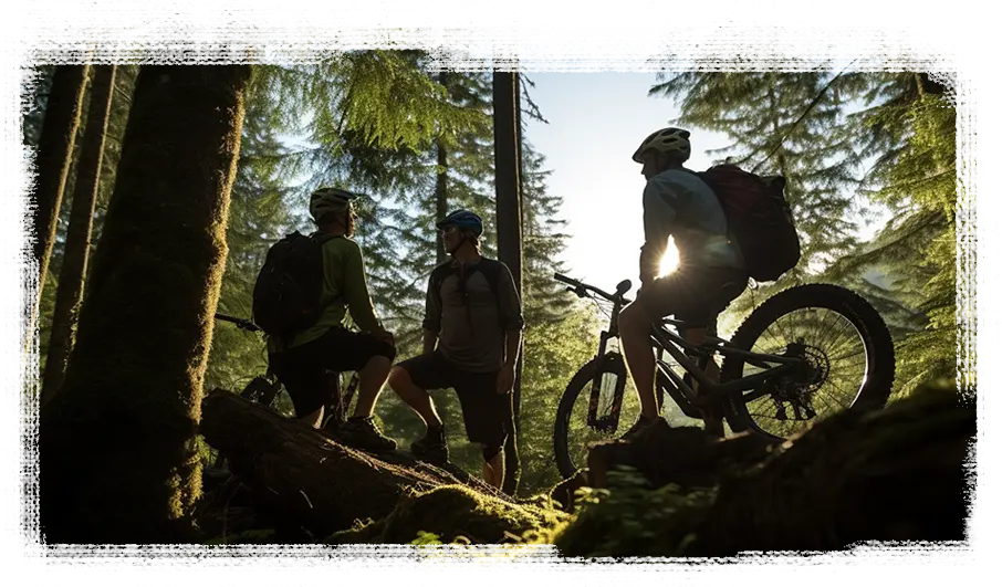
Kuhl Bike’s digital presence is dark and cozy, leaning into the shadows like a ride through the woods.

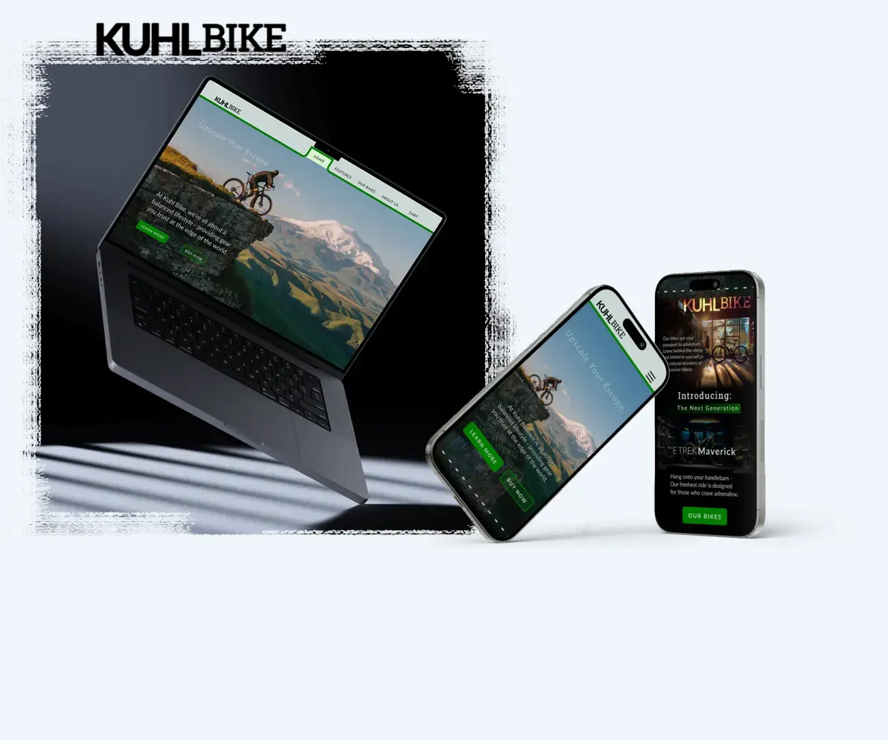
Kuhl Bike is a (concept) boutique bike shop in the Pacific Northwest. The market is saturated with competitors. The brand has to stand out by building community and welcoming new riders to the sport.
"Leo, a guy in his 30's stuck working and scrolling too much, hears the mountains calling. He comes across Kuhl Bike online, while searching for a way to explore the trails. A 'Meet the Team' section includes an interactive way to get to know the staff before showing up in person. Now he's ready to walk in, say hi to familiar faces and ask about the group rides."
This prototype shows how community-building can work as a competitive advantage. Design that builds community also builds loyalty – better retention, repeat customers and word-of-mouth advertising that money can't buy.